I hope this article finds you in a good mood because sometimes that is all it takes to harness motivation and creativity. I would like to start with a small disclaimer: this was my first project in Unreal Engine (UE) and I do admit that par of the workflow could be better and/or more optimized so if you have any comments, please do share them.
So let’s start. The dawn of this project was more than a year ago as an internal game prototype. We wanted to try a game with PvP gladiators and with a rock/paper/scissors mechanics. We had a week to do it so I kit-based and slap-dashed a lot of stuff just to make it in time. And, of course, the visual fidelity of the game was not the target here but nevertheless I wanted it to look at least nice-ish.
Image 01 – screenshot from the initial mobile game prototype
The game was scrapped for various reasons but I never really could let it go. And then, a year later, I stumbled across the old files while I was thinking about my next personal project. That’s when I decided to revisit the scene and redo everything from scratch, the way I had wanted it and seen it.
The initial concept I had was to remake just a part of the arena and use it as a backdrop for a gladiator’s fight scene. I had a static scene and two characters in mind at that point, and had an idea to render everything in Marmoset but I quickly ditched those plans. Shortly after I started rebuilding the scene, I immediately searched for a more engaging camera angle than the one from the game prototype but that was hard; I was limited by the small part of the arena and however I tried to move the camera, something was missing.
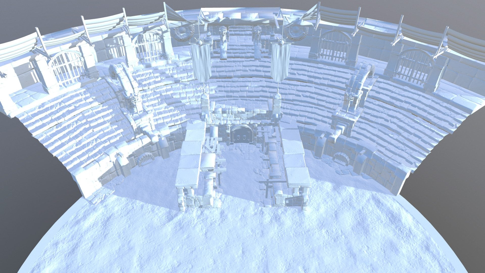
Image 02 – initial size of the arena
That’s when I decided to build the whole thing. I thought it would be interesting to present it as a moment in time but with the freedom to pan and rotate around, to explore the scene and absorb more pieces of the story by experiencing the environment, atmosphere and the characters. So I switched the idea of a static shot with one of a diorama. But the project was derailed again when I realised that Marmoset was not the best option to render scenes at this scale. I love Marmoset for presenting characters, props or small sections of scenes but I felt like this was out of its scope. I just couldn’t get the quality or flexibility I needed. That is when the second big change happened and I decided to switch to UE.
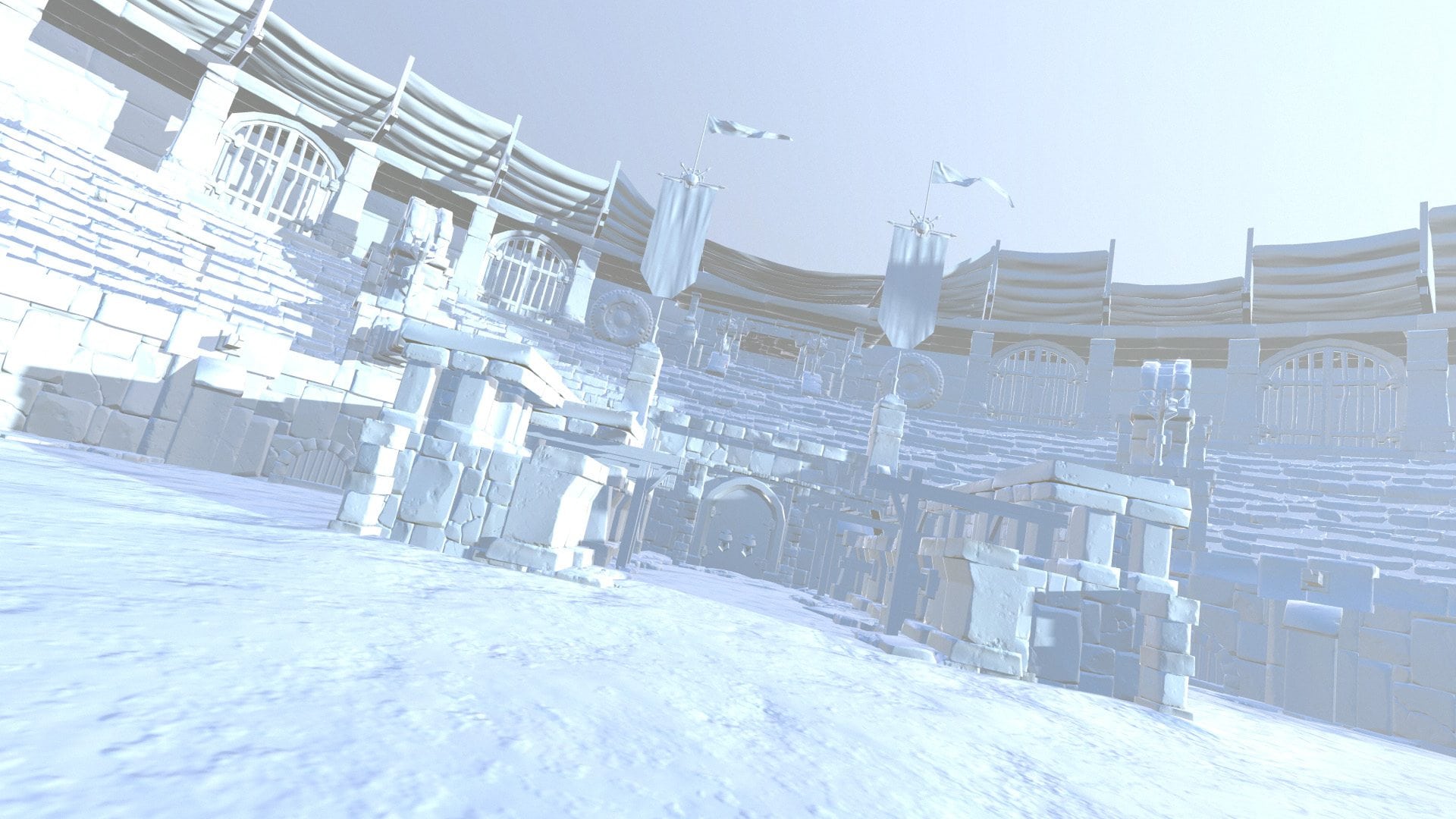
Image 03 – scene assembled in Marmoset Toolbag 2
I have a lot of Unity experience since it is my everyday work tool but I never had the chance to play around with UE on a more serious scale. I’ve seen some mind-blowingly impressive real-time stuff from other artists and that gave me enough motivation to learn something new and to try it out.
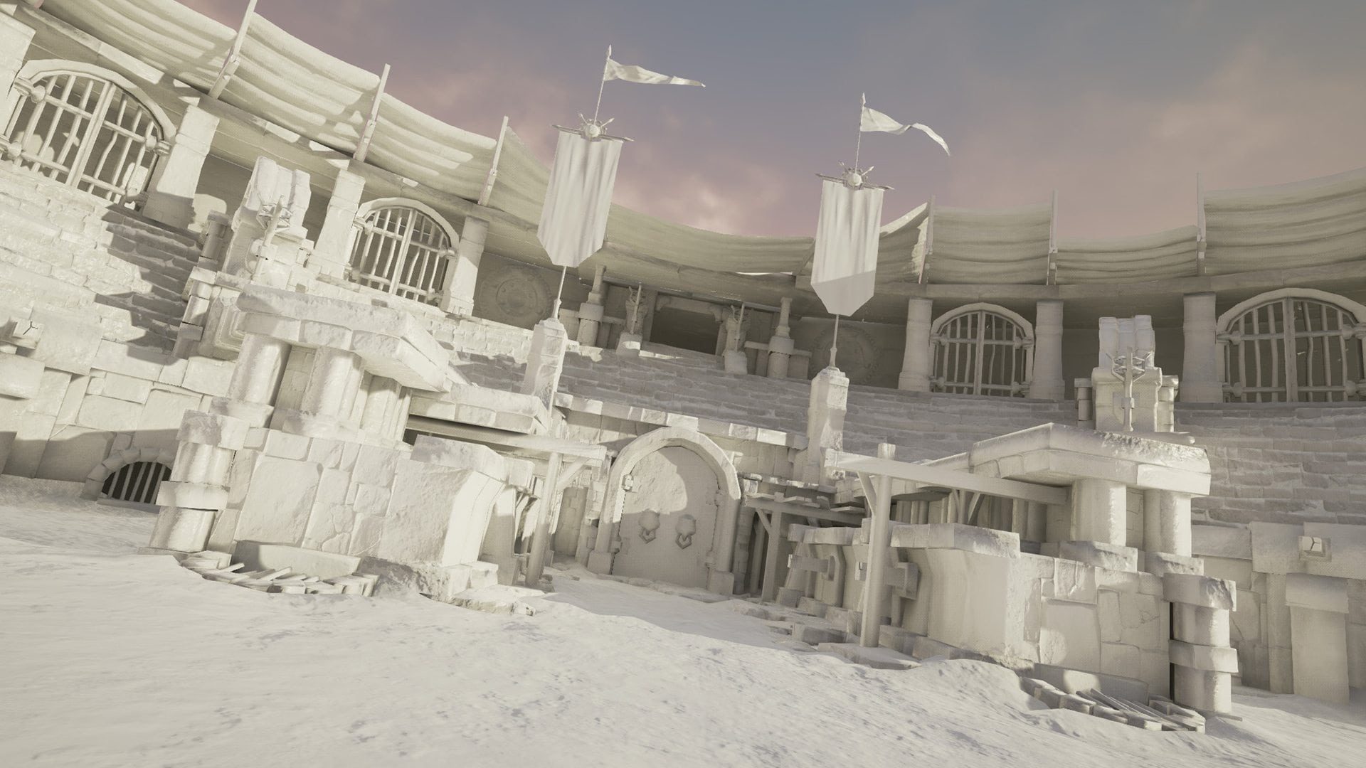
Image 04 – scene assembled in Unreal Engine; immediately showing more depth and atmosphere
This is the general story of a chaotic road that led me to do the scene in the way I did. It was filled with trial and error but I liked it since it made me try new things and learn as I went. I find it interesting that sometimes when I do personal stuff, it’s pretty straightforward — I know what I want to do and I just do it using the steps that are well known to me. And that is perfect for times when you are focused on the end result. But every now and then, I just let the project take the steering wheel at guide itself. It’s much more time-consuming and frustrating, but I found out it’s also much more educational and fun. You get the end result but the journey is enjoyable as well.
OK, now that we know what we want and how we want to do it, let’s go through some of the actual work steps.
Planning and Modeling
Because the project was going all over the place in its initial states, these two stages eventually got fused. The models themselves are extremely simple. Since the entire scene is mostly composed of rocks, I just started with basic shapes and simple poly-modeling — nothing fancy. Considering the initial plan to render everything in Marmoset, I laid out almost the entire scene in 3ds Max. I suggest you be smarter than me; if you are planning to make something like this in a game engine, just assemble the scene there, use instances and save yourself time and performance. I was too lazy to rearrange everything again because I knew I had a lot of work to do and wanted to focus on other tasks.
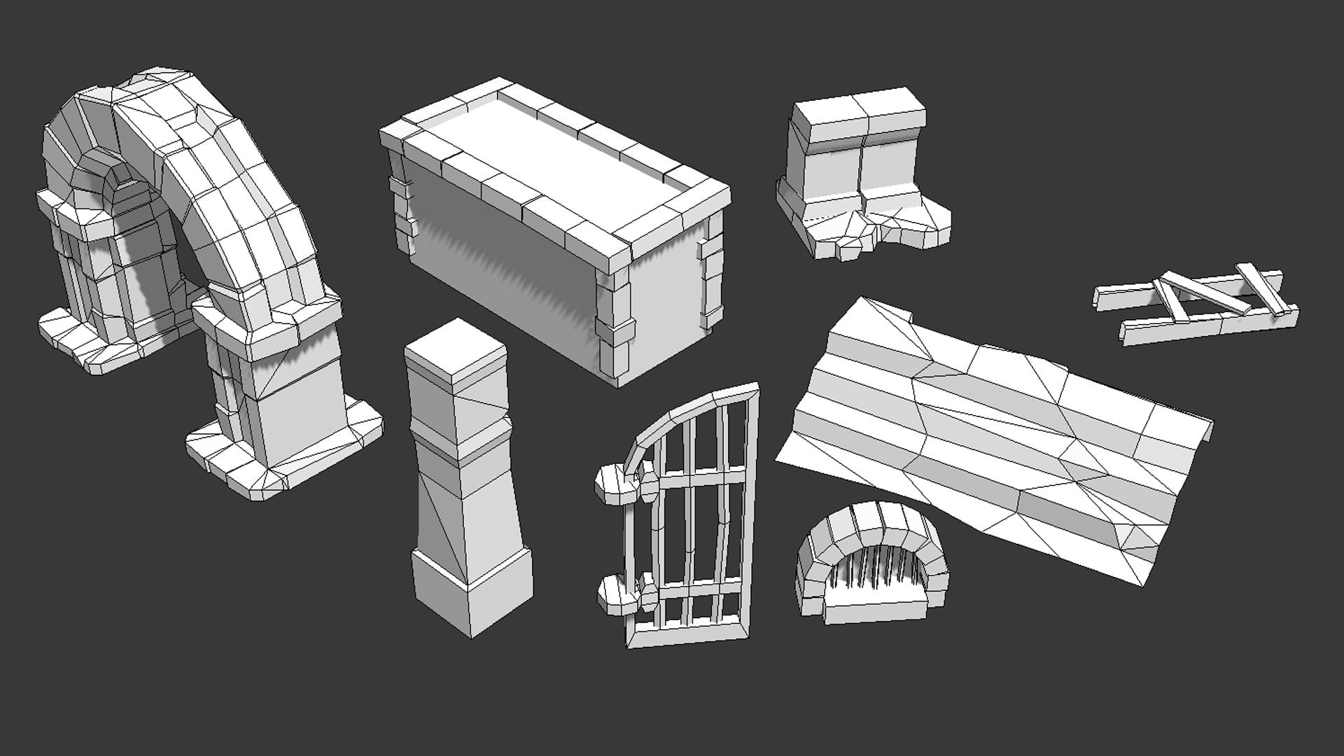
Image 05 – basic models used to build the scene
Now that I look back, I would definitely add more geometry to certain places; that is one of the drawbacks when you let the project go wild. You start with one thing in mind and end up with something completely different. Things get lost in the translation because when you are making real-time assets, technical limitations are important so try to plan ahead and avoid making those limitations into defects.
Sculpting
After knowing what the scene would look like, I separated every unique asset to a separate file, made UVs and imported them into ZBrush. My workflow there went like this: import a low poly model, subdivide many times with smooth off to get more geometry but preserve the shape, and a couple more times with smooth on to soften the edges. That gave me a good enough starting position.
Rocks were made using Clay brushes to add volume then Trim brushes to remove it. I’ve repeated and layered those steps couple of times until I got the stone look. Towards the end of an asset, I’d use Dam Standard with a low radius to define the major shapes, add more depth to crevices and insert a crack here and there.
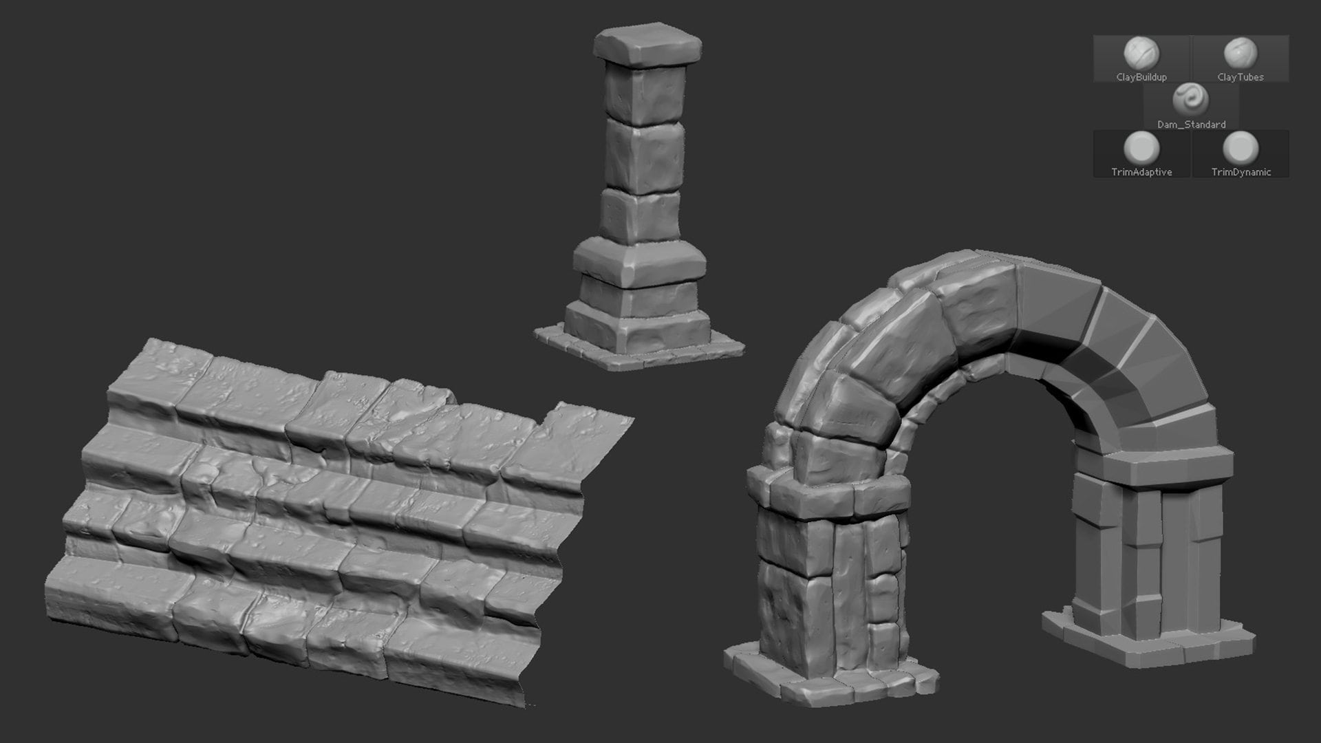
Image 06 – stone sculpts
For metals, I had the same start but didn’t sculpt them too much. Instead, I layered two or three surface noises (Erosion, Dent or Corrugated) of various shapes and sizes, and then used the Trim brushes in between the steps to add large scale surface deformation. I was aiming for an old iron look and that did the trick.
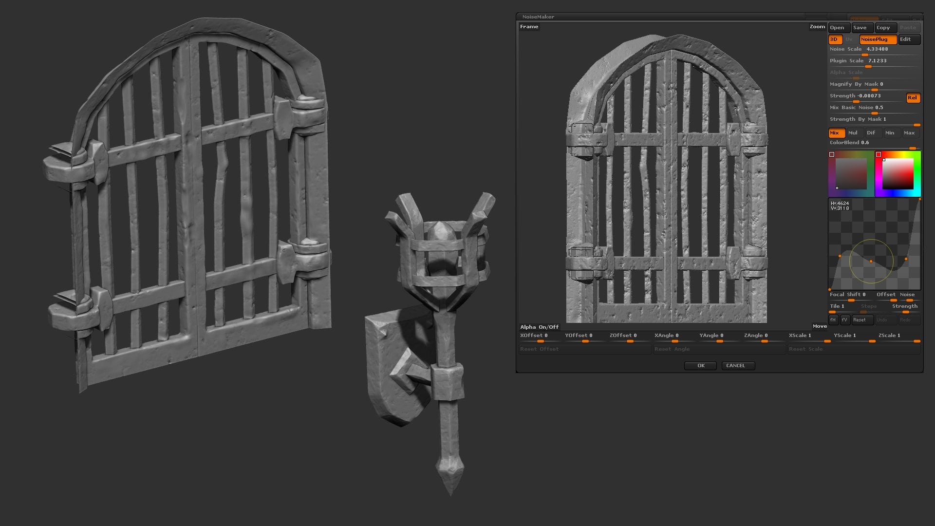
Image 07 – metal sculpts and example of a Surface Noise
Cloth had a slightly different treatment because I only subdivided it with smoothing on since I needed soft and rounded edges with a nice flow to them. So I just creased the edges I wanted to stay sharp. I heavily used the inflate brush to make it feel like the cloth was sagging and details were added by using very nice cloth folds alphas from Ahmed Teka. I didn’t sculpt any surface details or the torn parts because I knew I would add them in the texturing phase.
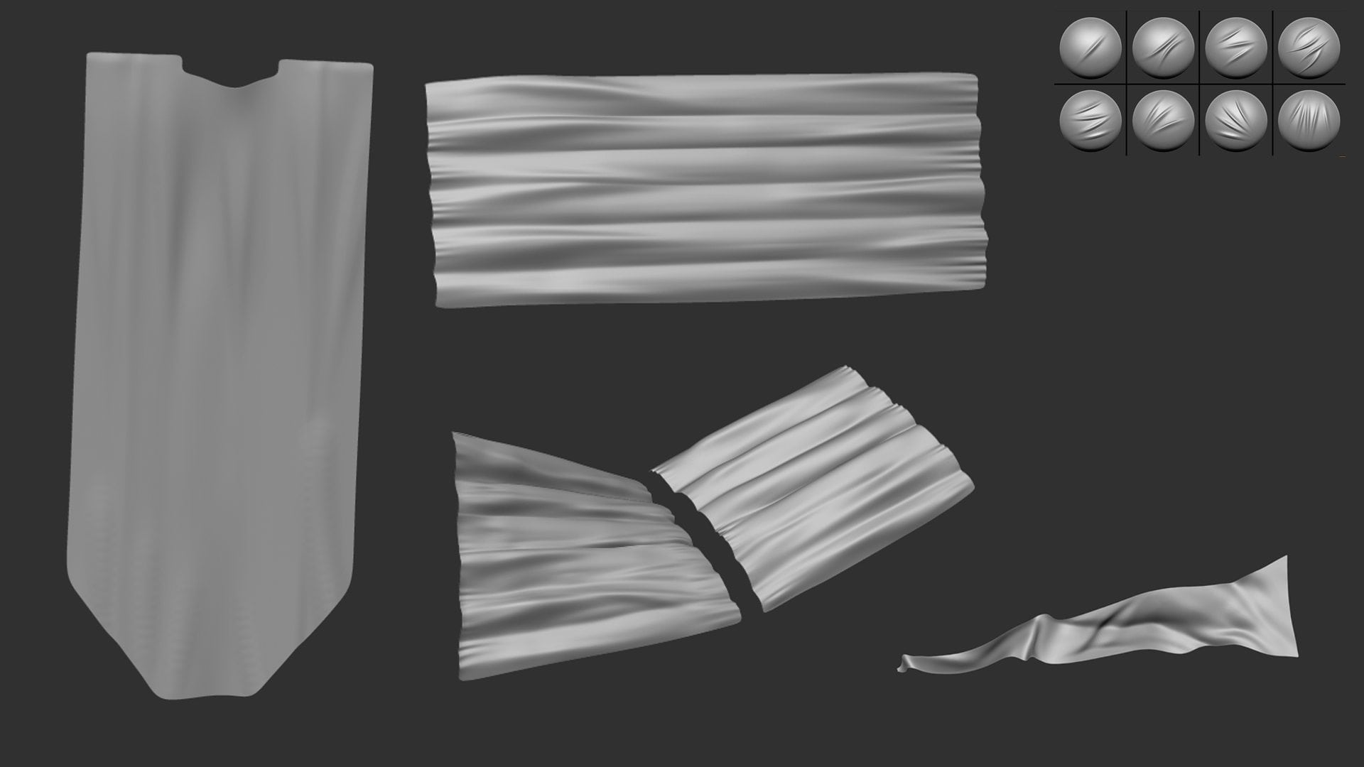
Image 08 – cloth sculpts and mainly used alphas
Texturing
One of the few things I knew at the very beginning was that I was going to texture everything using Quixel. I’d used it before on stand-alone assets and I wanted to test it on an entire scene. The quality of the scanned textures that Quixel has is second to none but the software could be better on the usability side. Since Quixel doesn’t have high to low poly baking, I exported the normal maps from ZBrush but everything else was baked in Quixel — AO, curvature, object space normals and position gradients.
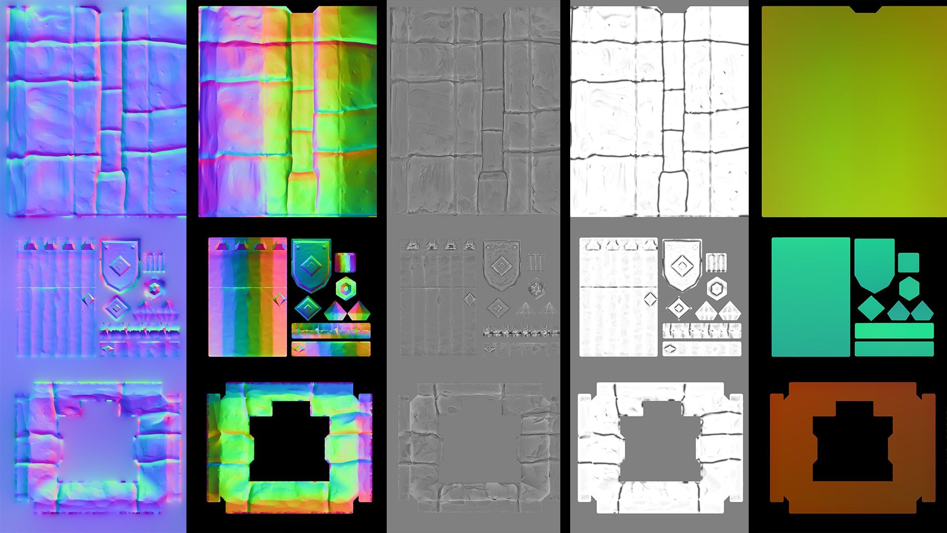
Image 09 – various baked maps; tangent space normal, object space normal, curvature, ambient occlusion and position gradient
First thing I did was a bit of exploring and look development. I started with a stone part since that was the majority of my scene and played around with textures. I was experimenting a lot of things like the color/darkness of the rock, how rough it was, whether it was more or less covered in sand…etc. This was a pretty playful part so I suggest you take your time to try everything. Quixel is your friend here since you can easily layer materials using their powerful masking system.
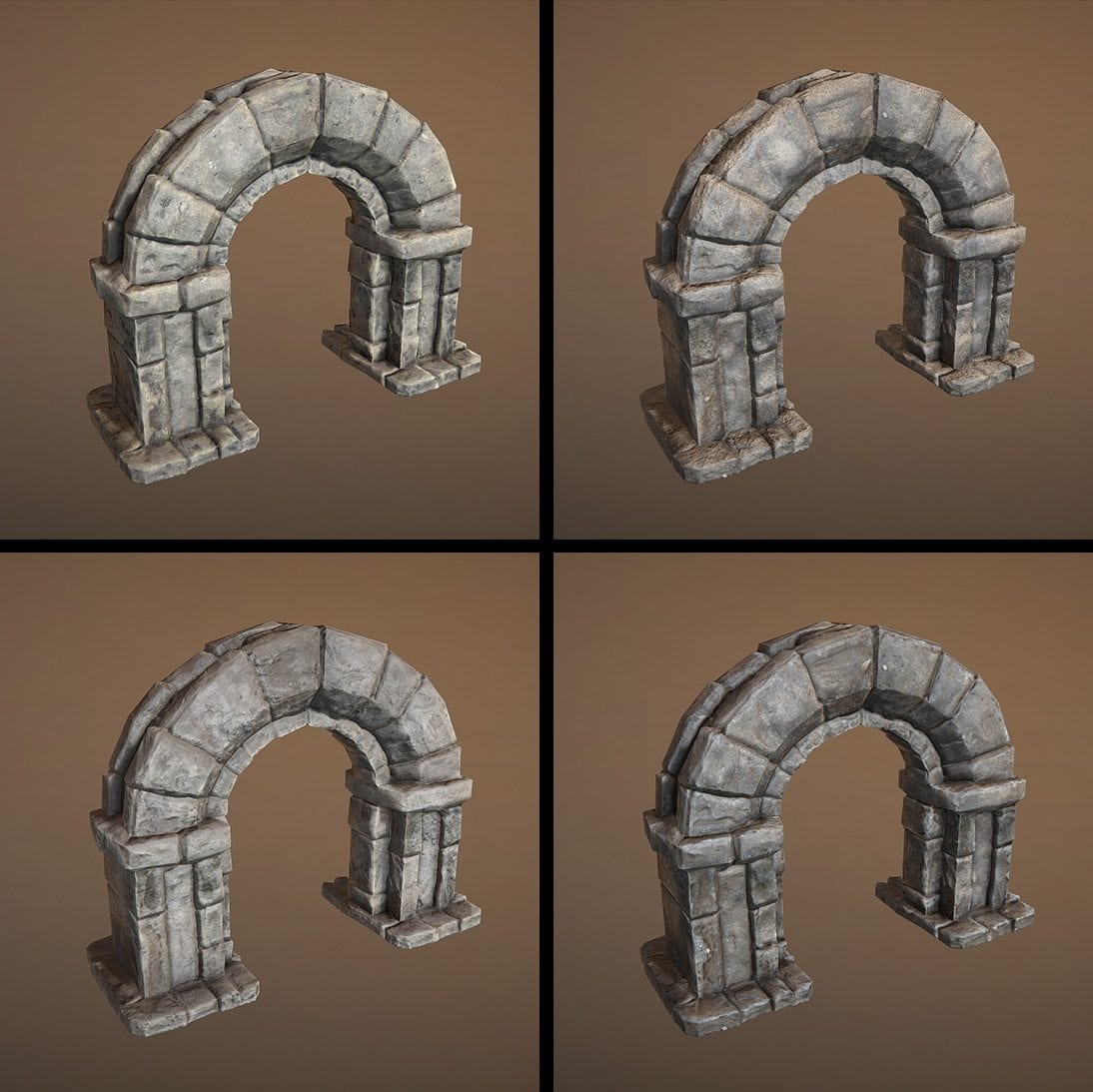
Image 10 – look development for the stone material
When I got the look I was aiming for, all the rocks were practically finished. I created a smart material from the lookDev and that gave me a preset defining all the different mixed materials, their attributes and masks. After that, it was just a matter of applying that smart material to all of the stone elements with some occasional individual tweaking for base color and amount of sand.
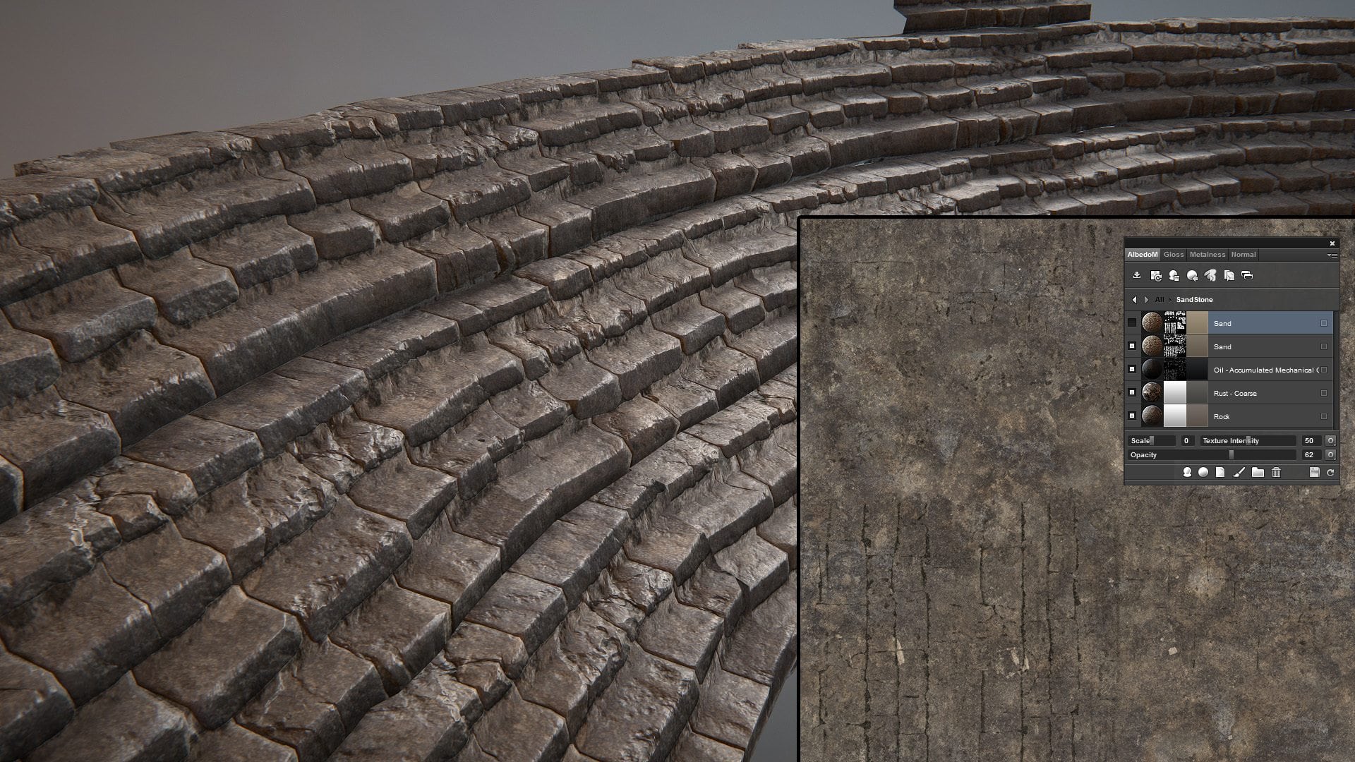
Image 11 – stone smart material used on the stairs and final diffuse map
Metal was much simpler since it just had an iron base and some coating on the top. I was afraid of how the transition from a metallic to a nonmetallic surface was going to look like in a metalness PBR workflow, but it turned out looking good.

Image 12 – metal smart material used on the torch and final diffuse map
Cloth was maybe the most challenging part. (Not for the texture though, that was straightforward: I used the cloth material for the base, then added some lighter color overlayed on the exposed parts, darker color multiplied in the occluded areas and a washout color for edge wear. I also added some additional dirt in the end).
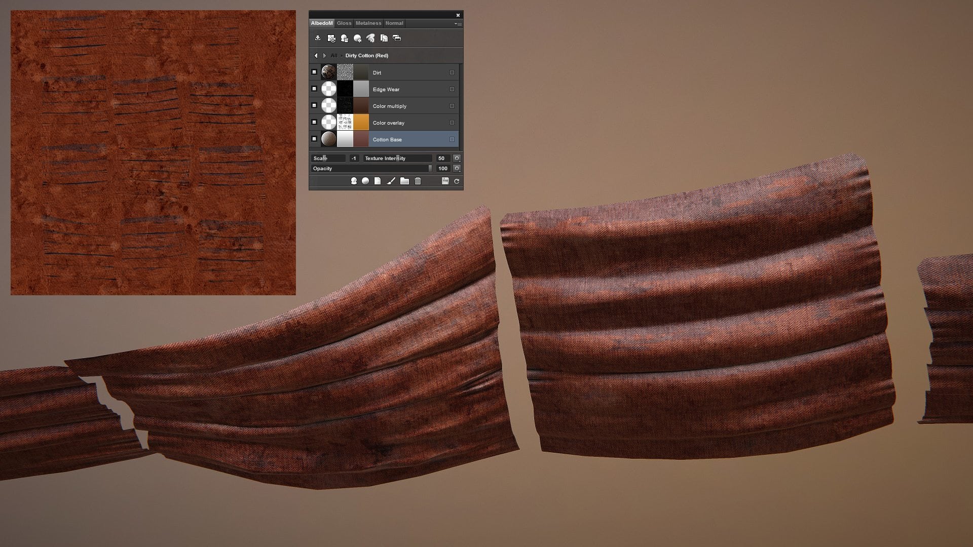
Image 13 – cloth material used on the shades and final diffuse map
What I had trouble with was the torn parts of the cloth. I went through a couple of trial and errors before I got something that fitted the scene. First, I tried to use Quixel to make some grunge masks and then just paint them in wherever I needed them, but that just felt uncanny. In the end, I opted for a photobashing approach. I gathered a lot of references of various torn cloths like denim, flags, curtains and shirts. I then cut out interesting parts, desaturated them and played around with levels to get the best possible alpha map segments. From there, I continued arranging them as puzzle pieces, trying to match the scale and give enough details to the cloth. But be careful, it is easy to go overboard!
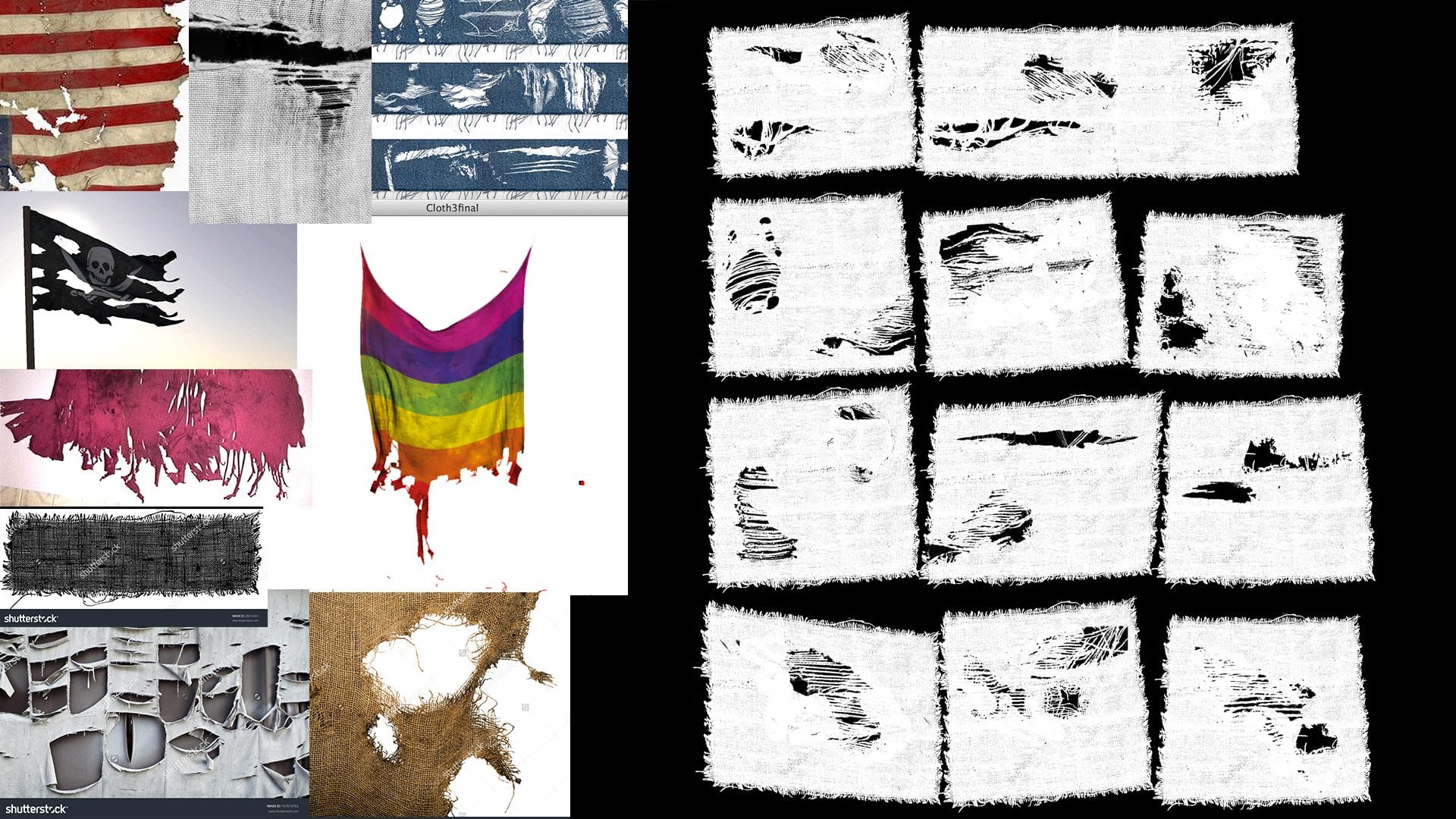
Image 14 – references I gathered for making the cloth’s alpha and the final result
The ground, well, I did that twice. At first, it was a simple plane modelled in max and modified it to look like there was some slight height variation and as if there was some dirt buildup around the edges. It was textured as an 8K map, combining two types of sand (coarse and rough), dirt and pebbles. All of that was mixed with hand-painted masks. From a distance, it looked OK but the plane was too large for one 8K map to look good from close up. I had an idea to split that plane into parts and have them use separate textures but that was a pain to do in Quixel. Anyhow, in the end, I chose the third — and probably the smartest — option; I rebuilt the ground in Unreal Engine using it’s terrain tools. I exported all the different maps from Quixel as unique tileable textures and then made a splat shader in UE that mixed those maps based on vertex colors. There is a tradeoff to this technique though — you get nice and crisp textures (even in close-up) but the complexity of mixing them is directly dependent on the amount of geometry that terrain has. So, as always, you need to find a balance between geo resolution (performance) and the complexity of mixing (looks).
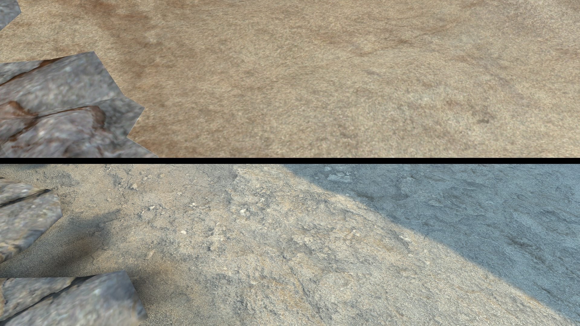
Image 15 – comparison of ground texture details; top – unique 8K texture, bottom – splat shader with three 1K maps;
Assembly
Now I had everything I needed to start packing it in UE. After importing all the models and textures, I created three materials for the entire scene. All of the materials used the standard 2-sided metal/rough PBR base with default UE settings but with some slight differences. Cloth material, for example, used the masked blend mode (for transparency) with a subsurface shading model and the terrain had a custom built mixing shader based on the layer blend node.
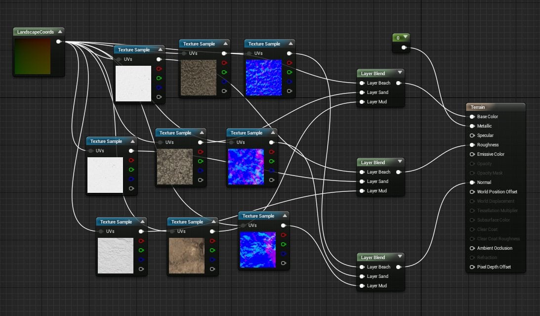
Image 16 – configuration of the splat shader used for the ground
This point was a huge milestone for me because it was the first time I had seen the entire scene, together with textures, assembled. And, even in its vanilla state, it looked good compared to Marmoset. I was really happy that I made a right decision; it also boosted my motivation to undertake the big amount of work that was in front of me. The scene was there but it was static so it was time to breathe some life into it.
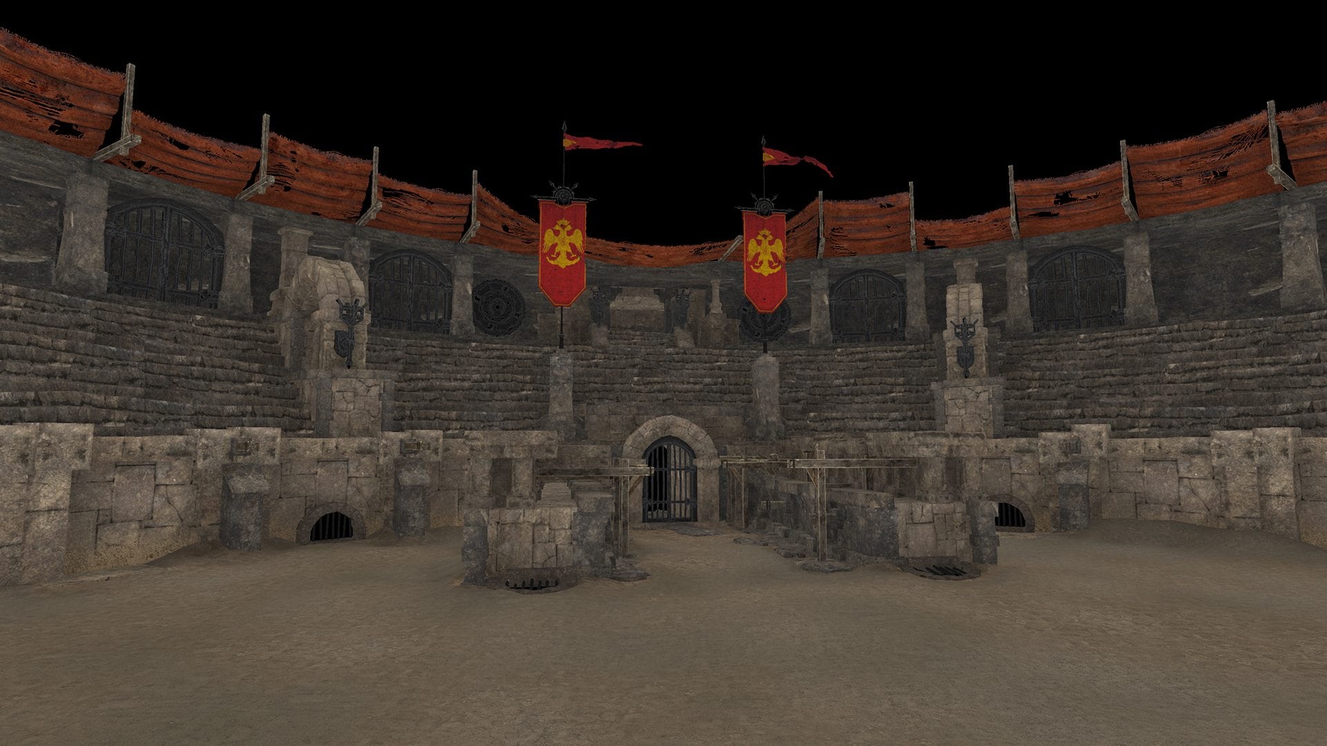
Image 17 – scene with just the textures
Wind
The first thing I tackled was animating the cloth parts and it was not as easy I thought it would be. I can’t elaborate on the details because my knowledge of the subject is basic and there are some nice YouTube tutorials to get you informed. In short, the workflow goes like this: you need nVidia’s Apex Cloth plugin that you can get for free from their website. Then, you need to create at least one bone and skin with the cloth object so that UE can recognise it as an animated object. After that, you apply the Apex cloth modifier to the cloth object and manually paint in the force influences on the vertex level. Of course, those vertices that are connected to something and should remain static must have the influence value of zero. You then separately export the skinned cloth object and an additional apex file that basically holds the cloth vertex information. When you import the object in UE, you will need to supply that additional file as well and then UE will consider that object as a physically animateable cloth object. All you need to do after that is to add some wind to your scene and things will work — it did take me some trial and error for things to work as I wanted, though! I left the UE’s wind at the default settings but I had to use really high force influences in order for them to behave realistically.
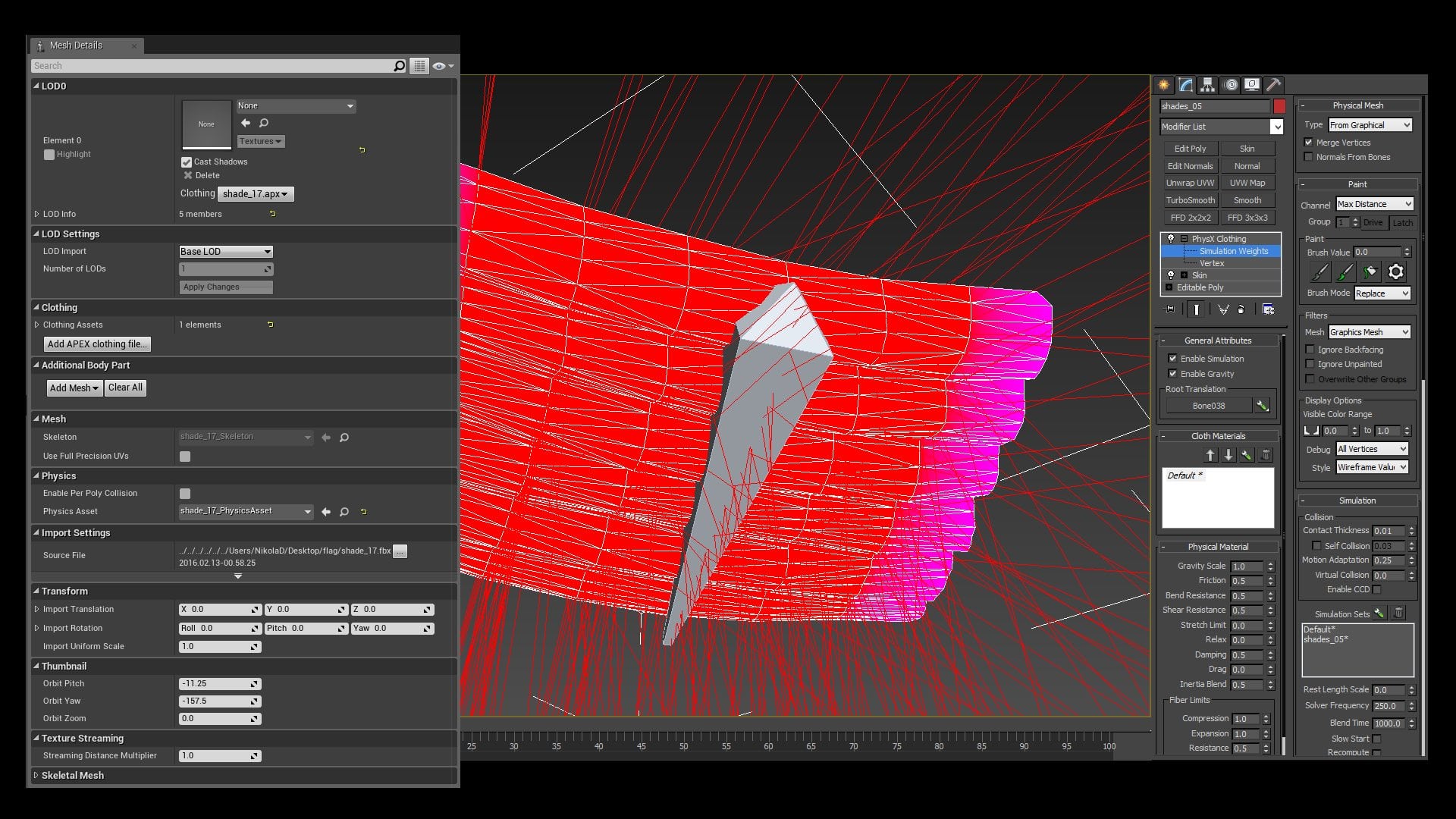
Image 18 – Mesh Details for setting up cloth in UE and how to define simulation-ready vertices in 3ds max
Foliage
The plants are actually the oldest trick in the book — just simple intertwined planes with a transparent texture. They were placed around using the UE’s foliage painting tool, which is really easy to use and powerful, and works for everything. You are not limited to foliage, as you can easily populate your level with props, cars, bricks….etc. An extremely useful feature!
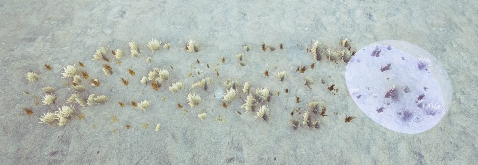
Image 19 – foliage painting tool in action
The plants were not physically animated using the wind but the animations were done in the shader using the SimpleGrassWind node. As the name suggests, it is simple to setup: you need a numeral value for wind intensity and a gradient map for wind weight that matches your diffuse UVs — black for the parts you want to be still and white for the windy bits. Then just plug the result into the World Position Offset of your material node and you are good to go. This approach is much simpler and resource friendly than the cloth one but you don’t get the same realism or the variation. In perspective, you could make a more complex shader that will modulate the wind intensity/weight for individual plants and improve the overall variety, but I didn’t do that.
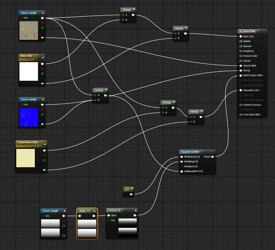
Image 20 – plant shader with SimpleGrassWind
When you start painting out foliage, it’s very easy to go over the top; trust me on that. Just be reasonable because this kind of set-dressing should benefit the overall composition and not flood it.
Lightning
The arena has several lights but the most important one is the directional light that simulates the sun. That is also the only light that casts shadows. Other lights are placed and the torches simulate fire. At first, I played around with real-time lightning since I had an idea to present the scene in some daylight changing time-lapse fashion but I opted out for a baked solution because I knew I wanted slow camera movements, close up shots and crisp shadows.
Image 21 – daytime cycle
I hadn’t planned this step ahead so some tweaks were needed. I had to manually adjust the lightmap resolution on an object basis so I could get a more unified texel resolution across the scene and thus lightmap consistency.
I added a BP_Sky_Sphere that creates a procedural sky dome based on the position of your directional light. Then I created a SkyLight that uses the entire captured scene as a light source and had one SphereReflectionCapture in the middle of the scene for reflections. I kept the bake settings at low for the sake of iterating quickly and when I was satisfied with the light/shadow position, I just turned everything up to 11 and waited.
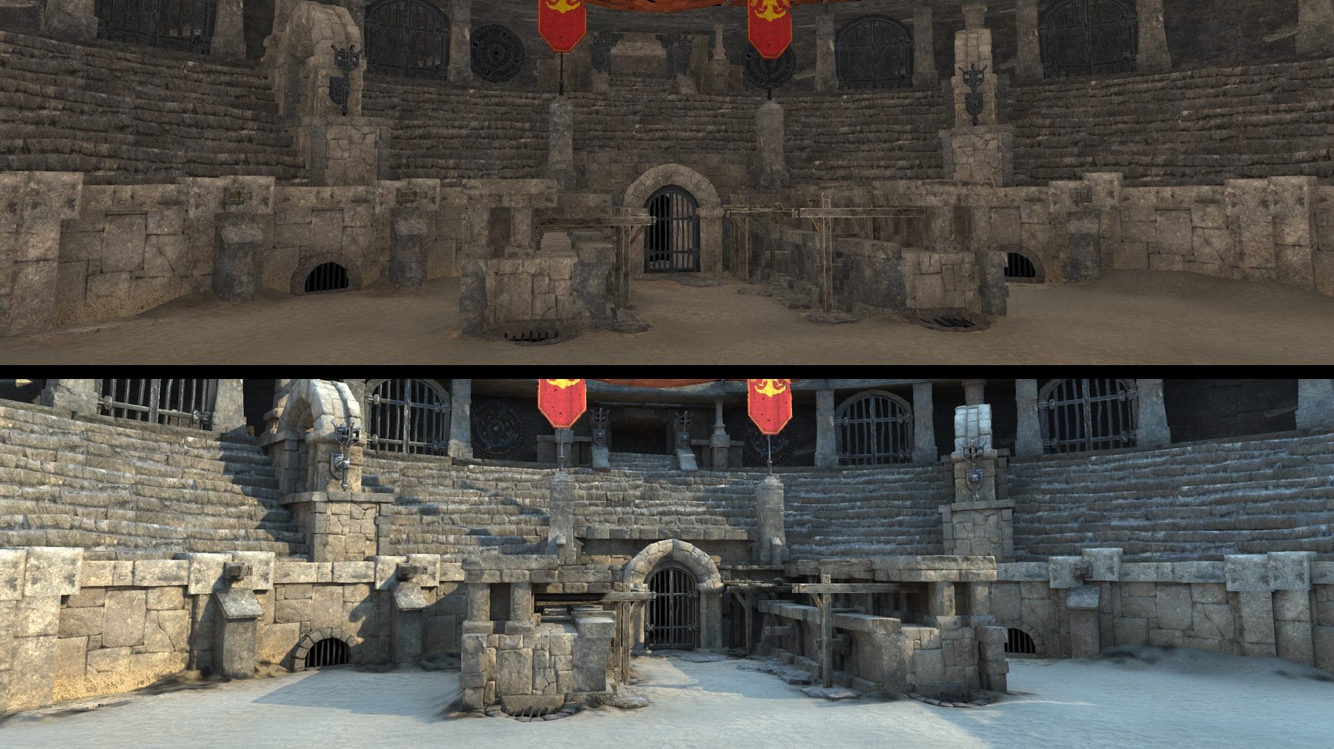
Image 22 – scene without and with light information
Particles
This was another thing that was completely new to me. I had the practical particle knowledge and experience from using them inside 3ds Max and Unity but UE’s Cascade felt different from the start. I’m still not sure I understand how it works to the fullest. I had three types of particles in the scene: fire, dust and sand. Fire is a modified version of the emitter that comes with UE’s standard package. It has suited me well from a testing and learning perspective, plus it looks good. I often find that reverse engineering, and modifying existing assets, is a good way to learn and explore, so do that when you can. The same goes for the dust — I just tweaked the settings of the lifespan/velocity/color/size to suit my needs and layered them across the scene. I took the things I learned and made a sand-storm that goes over the entire scene. It’s a very subtle effect from a simple particle system that has a smoke texture in 4 stages, a high velocity and a low opacity.
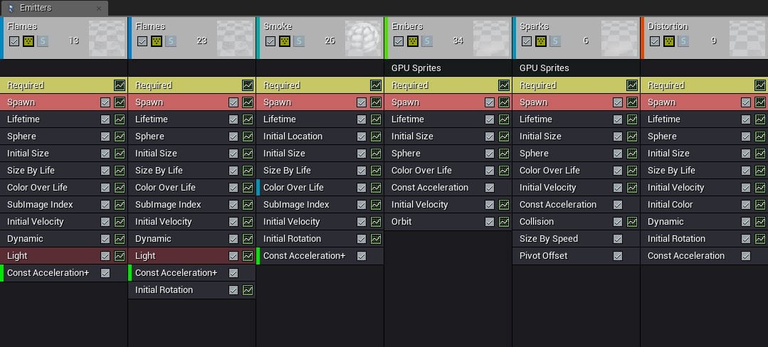
Image 23 – Cascade setup for the torch fire
Post-processes
After everything was there, it was time for some post processing. This is that crucial final step that will unify and polish everything you’ve done so far. Think of it as the icing on the cake. What you need to do is add a PostProcessVolume into your scene and mark it as Unbound so it affects the entire scene and off you go. Go wild, play around and find something that suits your style and your vision. Color grading is your biggest friend here; you’ll see how quickly you can change the mood and atmosphere of the entire scene. Color grading in Unreal works with LUTs (lookup tables) that you can easily author in Photoshop. Grab a screenshot of your scene, insert a default LUTs in the same PSD file and then use any of the Photoshop tools to adjust the colors — levels, curves, color balance, photo filters, gradient mapping… anything. Once you are satisfied with the result, just export the LUT piece of the image with all the adjustments and use it as a color grading LUT in UE. Simple and powerful!
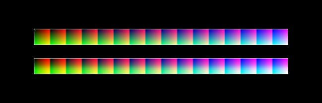
Image 24 – default LUT (top) and the modified one (bottom); changes look minuscule here but as you can see on the next image, the effect is drastic
That is exactly what I did. Aside from the color grade, I also added some bloom, lens flares, ambient occlusion and screen space reflections.
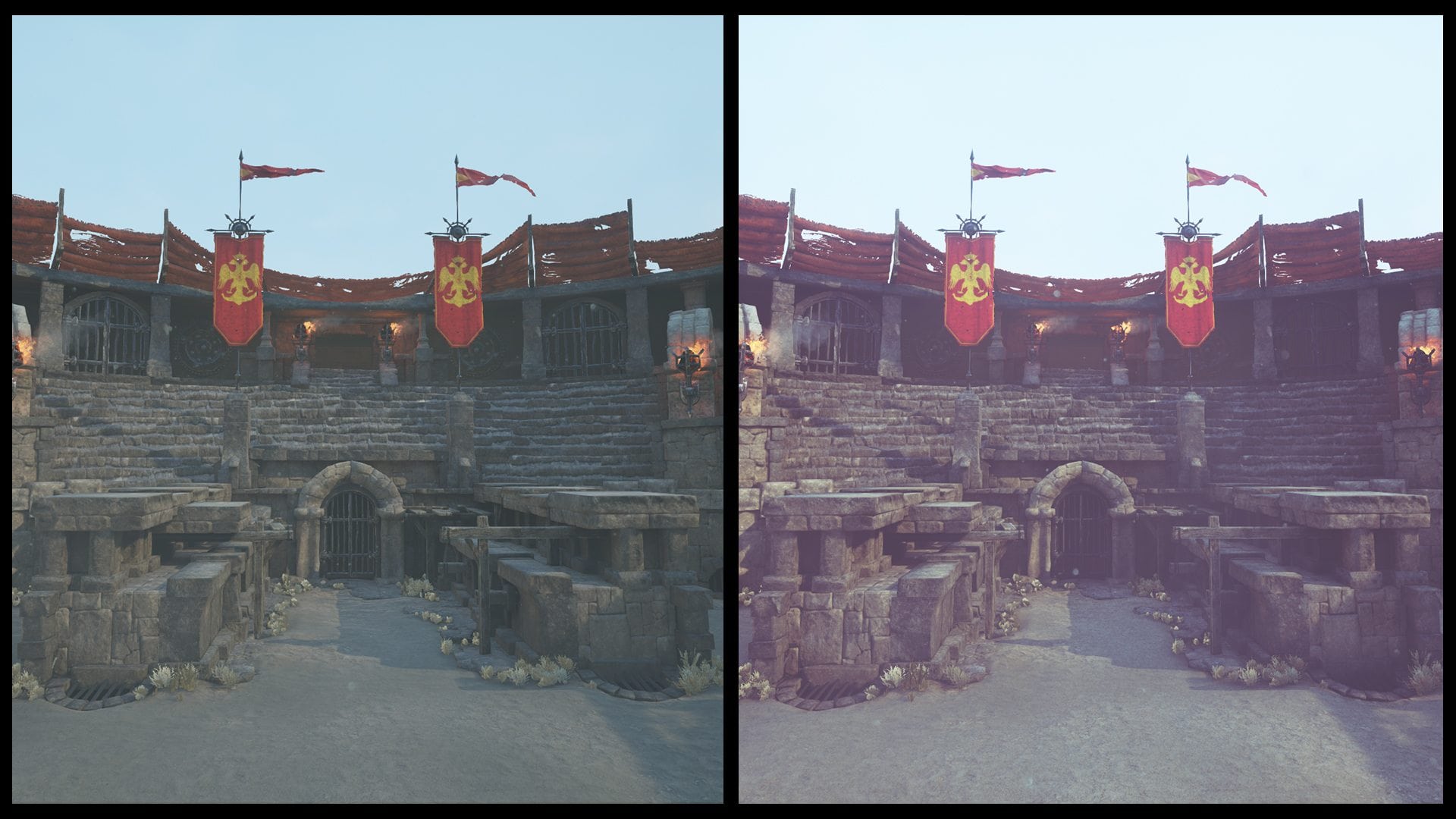
Image 25 – scene without (left) and with post processing (right)
Sound
In order for the video to be a complete and immersive experience, you need sound. Just watch any animation that you like with and without sound, and you will see the kind of impact it has. I actually spent two whole evenings just searching for the perfect music and I’m still not happy with my choice! From all the WIP screenshots I made during the production, I had the animation’s storyboard in mind and I knew what I was looking for: an epic sounding track that starts slow and dramatic, and that then abruptly switches to an upbeat tempo. Every time I find something promising, I play the music in the background and walk around the scene in UE and simulate the camera movement just to get the feel. In the end, I found my best match in YouTube’s audio library. It’s a very nice resource for royalty-free sounds. The only other sound that I’ve added is the wind you sometimes hear in the background.
Cameras
Now comes the part where you can sit in your director’s chair. The fun part of this is finding out the angles and compositions that suit your scene. Pay attention to the golden ratio, symmetry and the foreground/background balance but do unleash your creative freedom — it all comes down to these beauty shots. I chose my camera angles based on what I wanted to show (cloth, metal, closeups, entrance, fire…) and what I needed (inside for the beginning, outside for the middle and bird’s eye-view for the end).
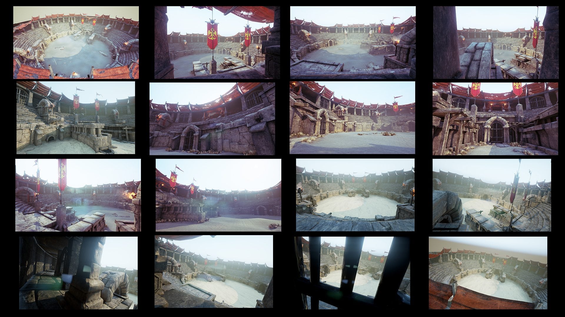
Image 26 – compilation of various camera angles that I thought were interesting
Choosing the shots was not that hard but animating them inside UE was a nightmare. In its current state, Unreal’s Matinee is just a pain to use. The way you select cameras and create their keyframes is very un-user friendly. I reset the animation or placed keyframes on a wrong camera so many times that I lost count. That’s why I’m really looking forward to Unreal’s new Sequencer that will hopefully remedy this problem and bring a much better UX and an NLE approach.
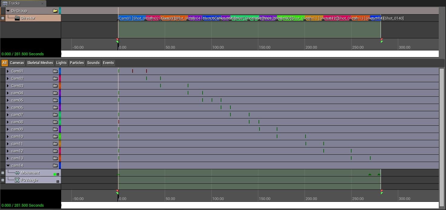
Image 27 – my Matinee setup with 14 cameras/shots
Final output
Once you set up your cameras, you are actually one click away from the rendered frames. And since this is a game engine, you won’t wait long. I rendered everything out in 4K and used AfterEffect to put the pieces together. I wanted to keep the straight look from UE so I didn’t do any post-production in AE.
For some additional beauty shots, you can check out the Artstation link here and I highly suggest you watch the final video in HD full-screen and with audio:
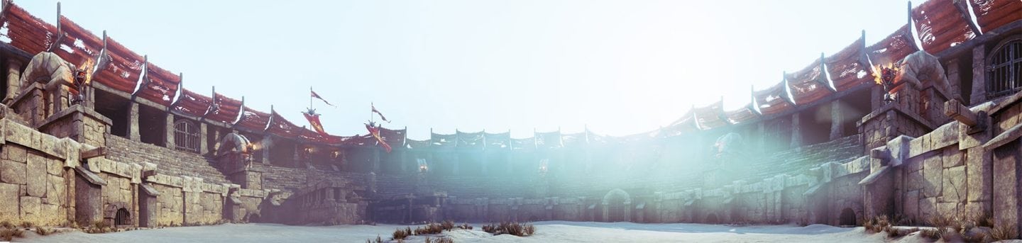
As a final touch, I leave you with this panorama.
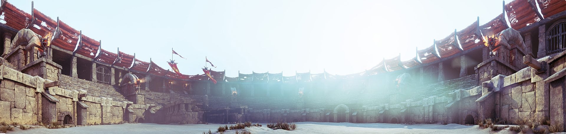
Image 28 – Panorama of the Arena
What’s next?
What I plan to do next when I get the time are the characters — two gladiators that will eventually use this arena as their battleground. I’m showing you one of their helmets as a sneak peak.
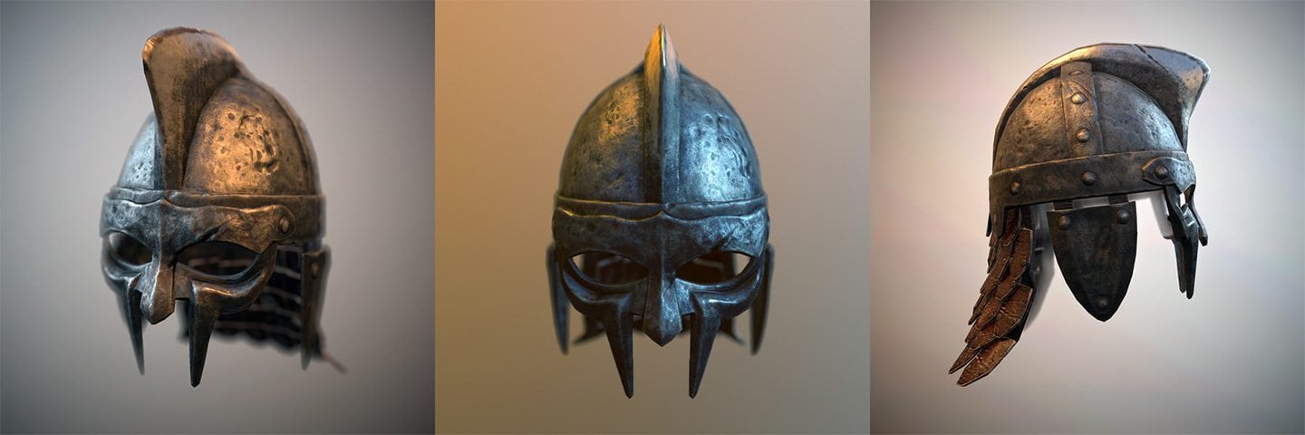
Image 29 – finished helmet for one of the gladiators
The End
Thank you for sticking with me until the end, I really hope this was useful and inspirational to you. I strongly think that we live in a time and work in an industry where constant self-improvement is a must, so try to find time to do it. But make it challenging and useful. I realized that doing smaller individual assets for self-improvement gave me faster gratification and appearance of progress but long-term projects like this are really what pushes me forward. It took me almost two months of occasional night work to finish this but I enjoyed every minute.
If you have any comments/question/suggestions just ask away! ![]()