I’m the type of person who is always advocating that artists should have versatile skills and be useful beyond the call of duty. I’m not that much of a believer in narrow expertise and long titles, and I’m not telling that you shouldn’t focus your career path but I do think that wider skilled people are more useful — especially in iterative environments and agile teams. Now, that’s me — I might be right, I might be wrong. I might be in quantum superposition but that’s not the point.
My goal is to show you that you can easily master a tool that’ll expand you and arm you with iteration speed and the visual quality of shaders. This is not for everyone, of course, but artists working on production/prototype assets can benefit from this, and therefore, so will the rest of their team.
Let’s jump into it! I’m talking about Shader Forge, a node based shader editor for Unity. It’s a commercial plugin that you can get from Unity’s asset store.
General Overview
If you ever used any node based software before then you already know how to use Shader Forge. Nodes are connected and evaluated from left to right, and they usually don’t have any individual settings. Even if they do, they are located directly on the node so it’s easy to read the entire graph at once. With just some basic tech art knowledge, most of the nodes’ names are self-explanatory but I suggest that you start with the official node list, then the tutorials and maybe some light wiki reading at the end. I admit that their documentation is not the best and online information is also limited but it’s more than enough to get you started. For more community info, you can check their forum or the polycount thread.
The way I do things for prototyping is to build the shader with a focus on hitting the visual target. Once the team has that signed off, we can then release the shader to a developer for optimization. As developers will testify, this really speeds up the process and removes a lot of ping-pong. Shader Forge is not good at optimization because it compiles more for compatibility. Having said that, it’s more than likely that everything you make will work on mobile as is (for testing purposes) — just don’t go wild as you can easily go overboard. You can even check with your developer forehand on what is more/less expensive, but again — the visual target first!
I will go through some of the shaders I made, explaining and showcasing them along the way. I ordered them from low to high complexity so there is some gradation and learning curve to it. Don’t get intimidated with those complex node graphs; once you start to analyze them, you’ll see that everything is approachable.
Water Foam
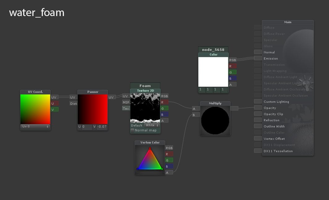
Let’s start with something fairly simple. All the magic here is done with the Panner node that slides the UVs in the desired direction. You supply it with the UV channel and the direction speed, and then you get the animated UVs for your texture to move. Since this material is unlit, I used the white color for emission and the foam texture for opacity. The texture itself is multiplied with vertex alpha (from the VertexColor node) so it will fade off at the edges. Side note: the green colored nodes (in this case, Texture2D and Color ) are the exposed parameters that you can tweak externally.
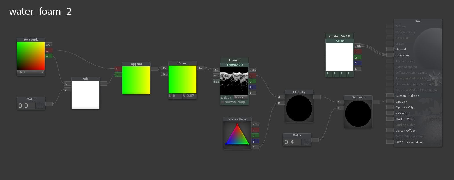
But since the foam next to the shore line needs overlapping waves, I extended the shader by adding a value of 0.9 in the V direction of the UVs and then Appended it back so it’d be a Float2 again. This way, I could use that value to offset the initial position of the UVs and adjust the timing. In the end, I subtracted a value 0.4 to reduce the global opacity of the material since we have two of them overlapping. As you can see, it’s easy to build on top of a shader and improve its functionality.
Caustics
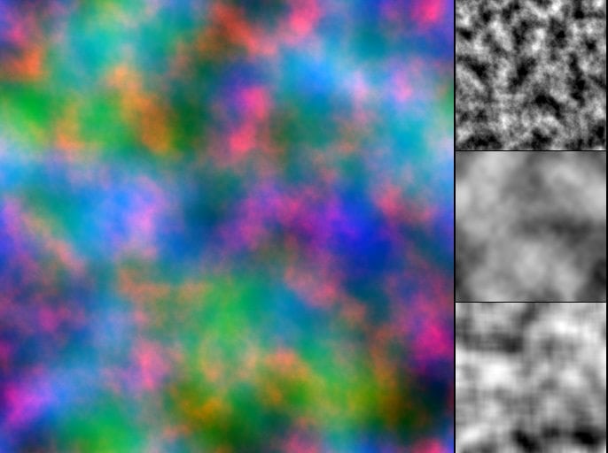
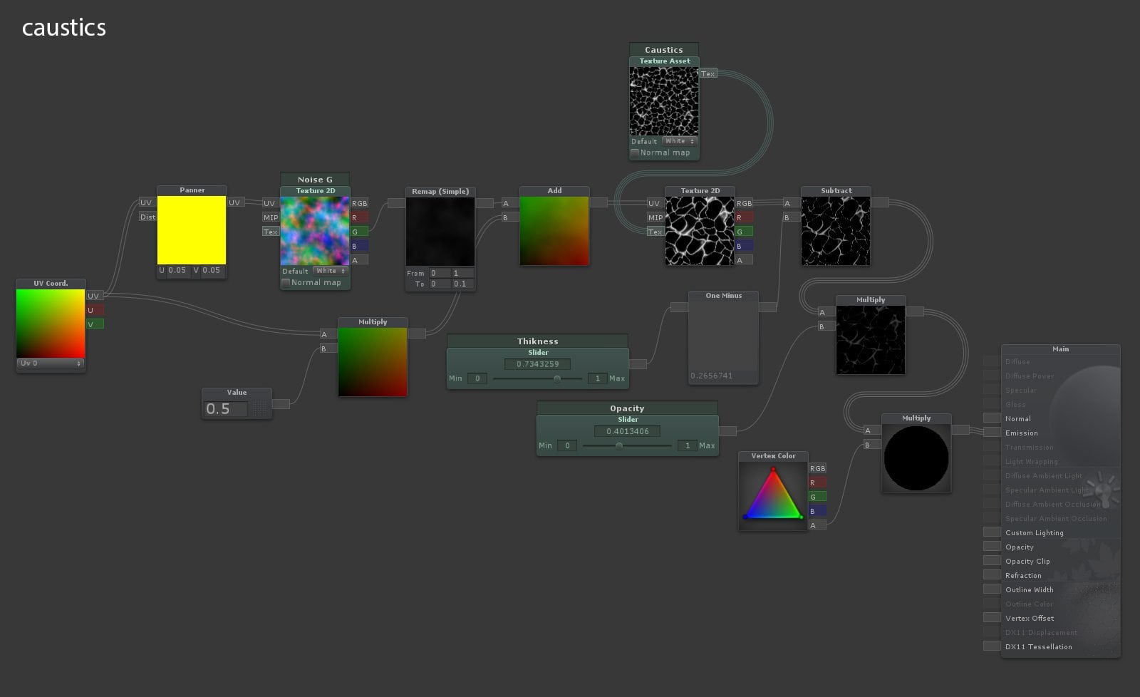
But you can also get very creative with Panner and UV nodes, such as by making a deformable caustics shader. In this case, we are not panning the texture itself but the “deformation”. I used a noise texture (different noises packed in channels), Panned and Added over the caustic texture UVs. The Remap node is used to tone down and control the amount of distortion and by Multiplying the UVs with a value, you can control the tiling of the texture. I also added additional controls like Thickness (Subtract) and Opacity (Multiply) for more finesse. Since this shader is set to the additive mode, I just plugged everything into Emission.
Water
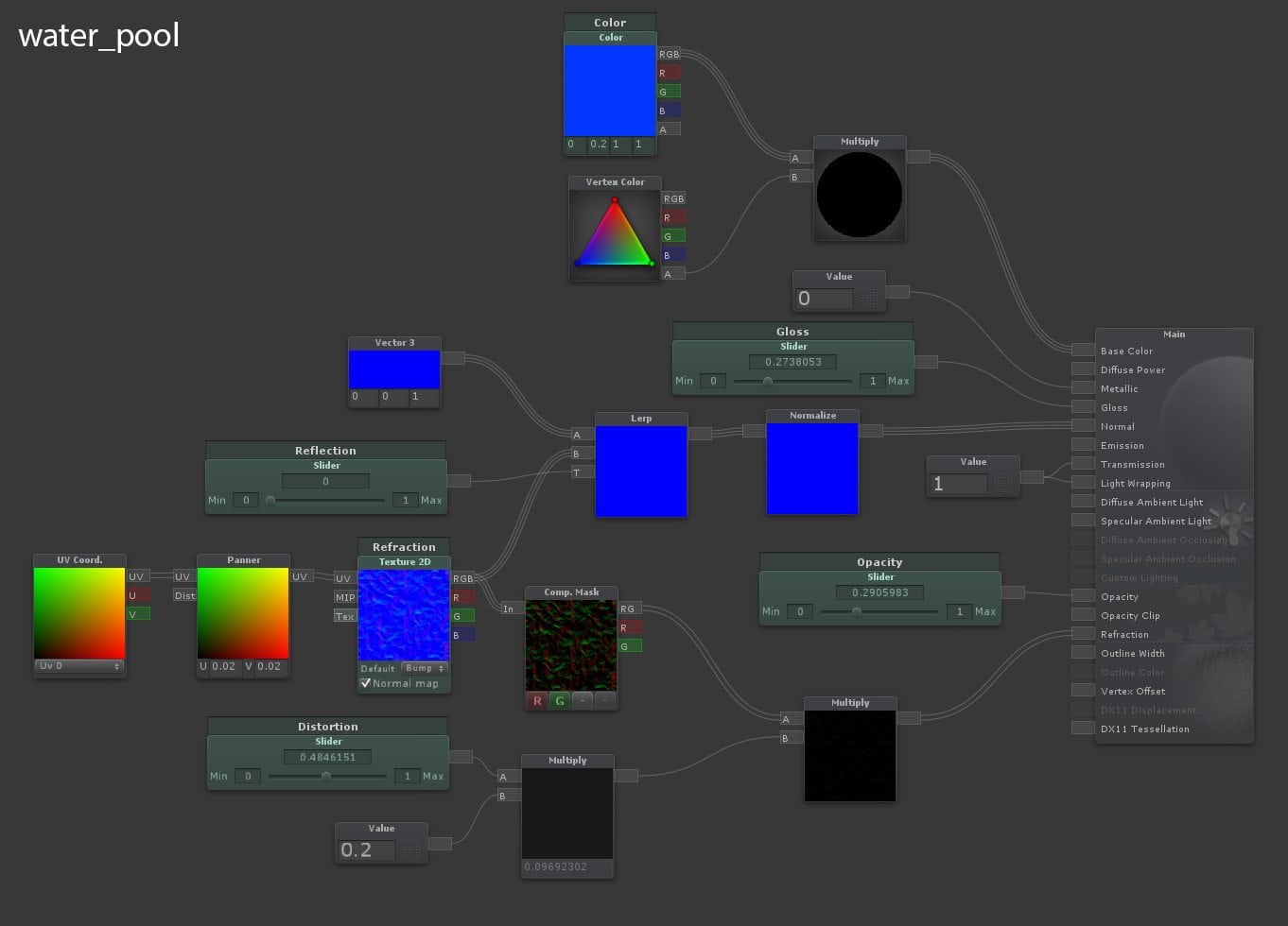
Following the same principles, we can try something even more advanced, such as pool water. This uses the full PBR lightning model so we define the Base Color, Gloss and Metallic first. Then we Pan the normal texture and just Lerp it with a simple up Vector3 so we that can adjust the strength of the normal. Lerp stands for ‘linear interpolation’ and it works as a mask; you can blend two inputs with a value/texture/etc. I Normalized the normal just in case and used the same panned normal map for the Refraction input of the shader. Since that input expects a Vector2 value, you have to use the Component Mask node to separate out only the red and green channels of the normal map. Refraction works as an offset in screen space so some additional Distortion control was more than useful. Also, for the Refraction to work, you need to have some Opacity on the shader and set it to be alpha blended.
Here is how water and caustics look in the engine, and I suggest you watch it in full screen. Btw, those sparkles are a particle effect:
Sea
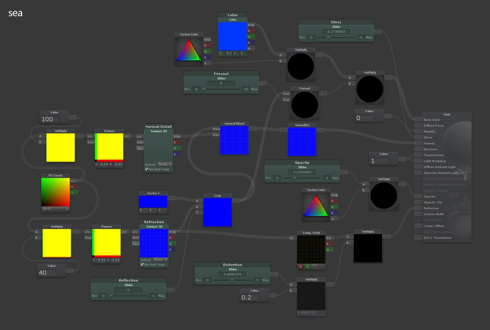
Following the proven M.O., you can easily level up that shader and build a sea surface. Here, I’m taking two normal maps: one for the general waves and the other for surface turbulence. Each has its own tilting and panning, and then mixing them with the Normal Blend node that does exactly that. I also introduced the Fresnel node to adjust the color at the glancing angles based on the normal map.
And here is that sea shader with the water foam in action. It has two layers of foam at the coastline and the defining color of the sea comes from the vertex colored underlying geometry. Watch in fullscreen.
Mossy Rock
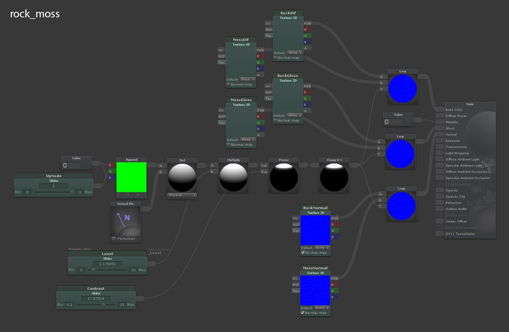
This one is a one-trick pony, but at least it’s a nice trick. All the magic happens in the Dot Product node that combines the world space up vector and the Normal Direction of the object. The Dot node is set to a positive result so you only get the moss on the top side of the rocks. After, I just used some Multiply, Power and Clamp nodes to control the amount, falloff and contrast of the effect. Use that as a mask for the Lerp node and you will have a rock that has moss on top of it no matter how you place it — pretty useful for environment prototyping. And it’s versatile as well; use it for moss, sand, snow or inverse it and make the stone part in the water darker.
A practical usage demonstration with some parameters tweaking:
Growing Tree
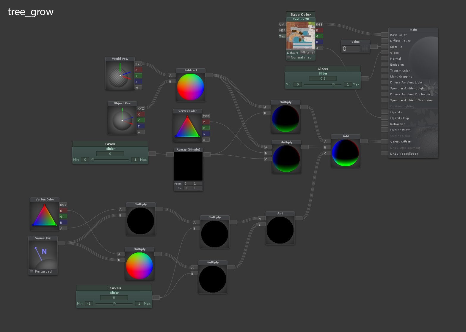
Short and sweet, just to show you what you can do with Vertex Offset. The idea is to manipulate vertex positions with the shader, which then opens up many possibilities, this being just one of them. This is where vector math comes in handy. The Vertex Offset node accepts a XYZ coordinate for how much every vertex should be offset. In order to get the needed control, I used some vertex data that you can see on the image below. The alpha channel of the vertex color was used as an intensity mask for the general tree trunk animation and the red channel as the same thing but for the leaves (secondary) animation. To animate the tree growth, I combined the vertex World Position and the Object Position to make them move down towards the pivot by controlling the amount of movement with the Multiply nodes and a Grow slider. Something similar was used for the leaves but here I used the Normal Direction node for movement. Once that’s done, you use the Add node to layer and combine all those animations. Now that I had external control via Grow and Leaves sliders, I made simple Unity animation clips of a tree growing up and going down and then triggered specific clips based on a tree entering or exiting a collider.
A mandatory and probably the coolest video in this post:
Wind
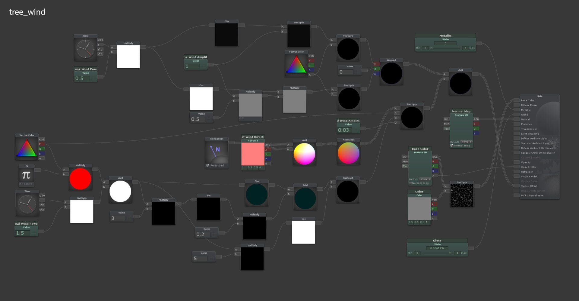
This shader looks intimidating but it follows the same principles as the previous one. The big difference here is that it uses the Time node to control the animation. This means it’s loopable and keeps on going. The rest of it is just a bunch of Sin and Cos nodes combined to make a more complex and interesting animation graph. I used this online tool to plot out something I thought would be a nice representation of the wind movement and then just transferred that into nodes — something along the lines of 2*sin(3x)+sin(10x)-cos(5x).
And the video:
Splat Shader
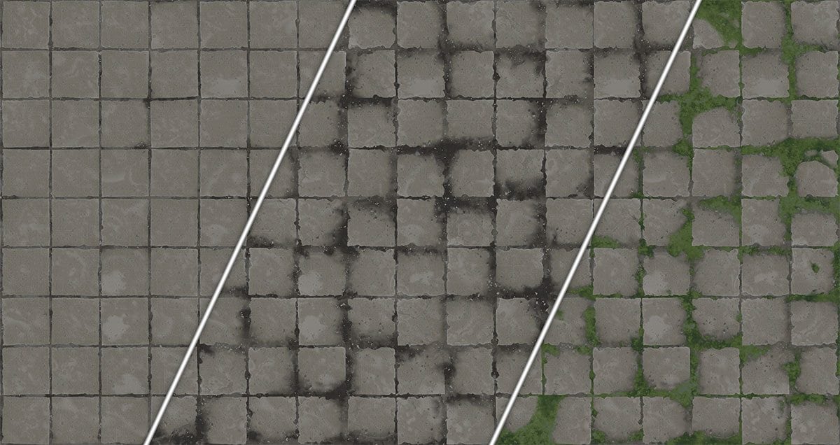
And let us end this with something that has a wider usage. As you may know, Unity does not have a splat shader out of the box, but we can recreate one in Shader Forge quite easily. It takes just two nodes: Vertex Color to access the data and Lerp to blend all the textures together. By chaining the Lerp nodes, you actually blend multiple sources on top of each other.
After that, your options are pretty open. For testing purposes, I used a tile texture with two variations (dirty and mossy) and the free Ikari Vertex Painter for Unity to paint in texture variations.
Conclusion
Going back to my opening statement, I hope the power of this approach is obvious. If you take these shaders further or have anything of your own, please share. And, of course, I’m here if you have any questions.


